

The “About” page is often the most visited section of a website. It acts as the public face of any organization, company or individual, highlighting who you are, what you do and most importantly, why visitors should give you their business.
Yet it’s also usually the page where website creators can get stuck. Text may be too long or full of technical jargon. Critical information is buried at the end. Or the most fatal error of all, there is no About page!
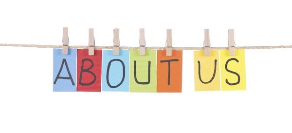
There’s an art to creating the perfect About page. Check out the eight tips below to make sure you get it right.
The “About” page is often the most visited section of a website. It acts as the public face of any organization, company or individual, highlighting who you are, what you do and most importantly, why visitors should give you their business.
Yet it’s also usually the page where website creators can get stuck. Text may be too long or full of technical jargon. Critical information is buried at the end. Or the most fatal error of all, there is no About page!
There’s an art to creating the perfect About page. Check out the eight tips below to make sure you get it right.
1. Make it visible
Too often, website creators bury the About page link all the way at the bottom of a homepage in teeny, tiny font—if they feature it on the homepage at all. Placement of the About page tab should match its level of importance. Think about it this way: Many of your website’s visitors are looking to find out what your company, non-profit, club, etc. does. We also know that more than half of web visitors spend fewer than 15 seconds on a site. If you don’t provide easy access to the information they seek, they’ll quickly navigate away from your site. Keep them on the hook by including a brief “About” section on the homepage, or putting a clear link in your homepage’s top navigation bar.
2. Keep it simple
Some get creative with naming their About page, calling it Our Journey, Nuts, and Bolts, Inside the Machine, or some other clever phrase. Resist this temptation! Visitors—especially those who are unfamiliar with your business—won’t intuitively connect these names with the information they’re looking for. “About,” “About Us” or “Our Story” will do just fine.
3. Include the most important information at the top
Your company history, staff, and plans for expansion are all interesting nuggets, but they’re not the most important information for first-time visitors. These users are looking for answers to three major questions:
- Who are you?
- What do you do? What business, service, etc. do you provide?
- How can you help me?
You should be able to answer these questions in a short “elevator pitch”—two-to-three clear, non-technical sentences. This high-level summary should appear at the very top of your About page. This short pitch is absolutely the most essential component of any About page—and possibly your website as a whole.
Here are a few examples of companies doing it right:
99designs: Hi there. We’re 99designs, the world’s largest online graphic design marketplace. We connect more than one million talented freelance designers with creative people, genius entrepreneurs, savvy businesses… anyone who needs great work.
Trello: Trello is the easy, free, flexible, and visual way to manage your projects and organize anything, trusted by millions of people from all over the world.
Apple: Apple products have always been designed for the way we work as much as for the way we live. Today they help employees to work more simply and productively, solve problems creatively, and collaborate with a shared purpose. And they’re all designed to work together beautifully. When people have access to iPhone, iPad, and Mac, they can do their best work and reimagine the future of their business.
4. Make it scannable
The high-level summary may be the most critical part of the About page, but it’s not the only piece of information that describes who you are and the services you provide. Supplemental material is great, but only if it’s presented as digestible bits beneath clear headings. These will vary depending on the type of organization and mission, but common sections include:
- Our History: A brief narrative about the company’s founding and evolution.
- Our Staff: Photos and short bios of your employees or, if a large organization, just company leadership.
- Our Products/Services: List and explain your offerings, and provide photos.
- Success Stories: Highlight a few major outcomes or stories of impact that will impress readers.
- What Our Customers Are Saying: List a few quotes or testimonials from long-time customers or clients who are happy with your service.
You can use columns to add these sections with a friendly team photo or corporate image. These sections are also great places to provide hyperlinks to other relevant pages on your website where visitors can get more detailed information on a specific topic, product or service that interests them.
5. Give them the facts—not flowery language
There’s a common expression amongst writers that you must “show” readers information, not “tell” them. In describing your organization, mission and services, use data and specific examples, not overblown adjectives or corporate jargon.
GrubHub’s elevator pitch is a great example of concrete, compelling descriptions: GrubHub is the nation’s leading online and mobile food ordering company dedicated to connecting hungry diners with local takeout restaurants. The company’s online and mobile ordering platforms allow diners to order directly from approximately 35,000 takeout restaurants in more than 900 U.S. cities and London. Every order is supported by the company’s 24/7 customer service teams. GrubHub has offices in Chicago, New York, and London.
Listing the number of restaurants involved and the number of cities where GrubHub has a presence shows the company’s scale, rather than tells it. By noting its 24/7 customer service, customers will know that GrubHub is reliable and dependable. And the company avoids technical jargon or corporate lingo by simply describing GrubHub’s mission as “connecting hungry diners with local takeout restaurants.”
6. Reflect your organization’s personality
Readers will understand who you are by what you say as well as how you say it. Make sure the tone of your website matches the personality of your business. For example, the tone of a website for a funky coffee shop will be very different than that of a research institute. Just like a website for a local comedy club will have much lighter air than a website for the local hospital. It is sometimes helpful to start by making a list of words that describe your organization and its overall vibe. Let these words guide your About page’s content, tone, and style.
7. Use multimedia to enhance your story
Web text is important, but enhancing the copy with photos, videos and graphics can make it exponentially more impactful. Experts say that the human brain processes visual information 60,000 times faster than text. And Buzzfeed found that visitors spent 100 percent more time on web pages with videos.
Try supplementing your elevator pitch with a short video that shows your business’s work in action (check out this example from National Geographic). Or describe the company history through an interactive timeline. Include photos of staff and products or short video interviews with company leaders or clients. And explain your sales growth, impacts or complicated processes like supply chains through graphics.
8. Keep content fresh
Your business or organization will inevitably evolve over time. So should your About page. Be sure to review your content at least once every six months, and update so that it’s timely, relevant, compelling and true to your mission.